
 | Wiffle Logos in Words | |
| by Brandon Corbett |
One thing I learned long ago, on a ship made of piled cushions with a blanket for a sail, is that every pirate needs a good mark for his flag. I have also learned something about myself while working on this site: I find pirate motifs make incredibly cool Wiffle logos. Wow. Did I really just learn that at nearly thirty I am still a giddy, seven-year-old boy when offered a jolly roger, swashbuckling, swordplay, booty and high seas fantasy? I am going to assume none of that is a problem, and offer you five of my favorite pirate-themed teams out there sailing the Wiffle seas.
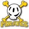
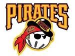
Pirates (HRL)
The HRL Pirates nail what I think works so well for the look in Wiffleball: bold, often bright colors and playful imagery that, even when it hints toward a bit of badass, stays jovial or a bit ridiculous (in a good way). The HRL crew's look is a simple, stark Wiffle-skull and cross bones. It pulls off "mean" in a 'cartoony villain you root for' way, which - along with the font used for the team name - fits the game of Wiffleball perfectly.
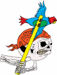
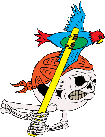
No Big Deal (KWL)
No Big Deal's 2011 logo almost falls into '3 a.m., drunk in a tattoo parlor' design territory with their Wiffle-skull, but the silliness of what is going on saves it. The parrot takes this over the top (note the wing piercing). I really want to train a bird to speed up my swing; I am certain no league has a rule against this, and it guarantees not only an All-Star season but an Animal Planet TV series, as well.
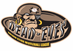
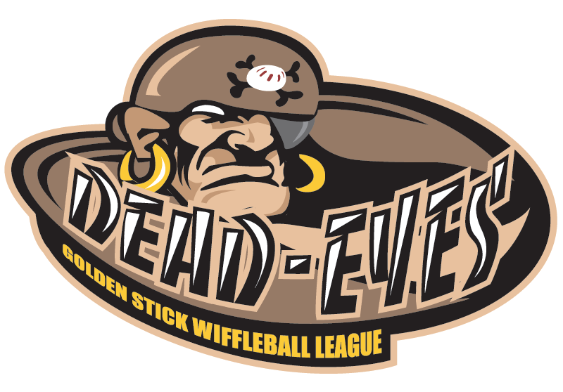
Dead Eyes (GSWL)
The Dead Eyes of Golden Stick elude the bright colors, but their drab browns work well for them. Any time you can work a term usually reserved for sniping into pirates you are onto something. When that involves the eye patch you are riding high. Throw a unique wiffleball* (5 holes!) into your cross bones mark on top of that and you are just showing off!
* Non-standard hole arrangements are always a welcome touch.
Pirates (NLWL)
Westside Story and a pirate have a kid; does anyone really want to mess with their offspring? Awesome look. Sure, they use Pittsburgh's wordmark, but the style and color of everything else more than make up for it. The bandanna looks better than its Major League counterpart, while the bowler hat steals the show. At first glance you might miss the 'angry eye' in the details, but that fits this whole "Wiffle and pirates are always fun" theme nicely.

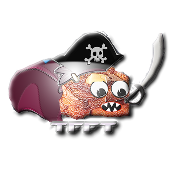
Triad Fighting French Toast (WSWL)
Breakfast food + big pirate hat + cutlass and cape = swoon!
I am not sure what else you could possibly need me to say; it is a trifecta of hilarity and awesomeness for Triad.
Pirates (HRL)
The HRL Pirates nail what I think works so well for the look in Wiffleball: bold, often bright colors and playful imagery that, even when it hints toward a bit of badass, stays jovial or a bit ridiculous (in a good way). The HRL crew's look is a simple, stark Wiffle-skull and cross bones. It pulls off "mean" in a 'cartoony villain you root for' way, which - along with the font used for the team name - fits the game of Wiffleball perfectly.
No Big Deal (KWL)
No Big Deal's 2011 logo almost falls into '3 a.m., drunk in a tattoo parlor' design territory with their Wiffle-skull, but the silliness of what is going on saves it. The parrot takes this over the top (note the wing piercing). I really want to train a bird to speed up my swing; I am certain no league has a rule against this, and it guarantees not only an All-Star season but an Animal Planet TV series, as well.
Dead Eyes (GSWL)
The Dead Eyes of Golden Stick elude the bright colors, but their drab browns work well for them. Any time you can work a term usually reserved for sniping into pirates you are onto something. When that involves the eye patch you are riding high. Throw a unique wiffleball* (5 holes!) into your cross bones mark on top of that and you are just showing off!
* Non-standard hole arrangements are always a welcome touch.
Pirates (NLWL)
Westside Story and a pirate have a kid; does anyone really want to mess with their offspring? Awesome look. Sure, they use Pittsburgh's wordmark, but the style and color of everything else more than make up for it. The bandanna looks better than its Major League counterpart, while the bowler hat steals the show. At first glance you might miss the 'angry eye' in the details, but that fits this whole "Wiffle and pirates are always fun" theme nicely.
Triad Fighting French Toast (WSWL)
Breakfast food + big pirate hat + cutlass and cape = swoon!
I am not sure what else you could possibly need me to say; it is a trifecta of hilarity and awesomeness for Triad.
