 | Wiffle Logos in Words | |
| by Brandon Corbett |
Wiffler's Digest has had a poll up asking whether or not "you approve of Wiffleball leagues using MLB team names." I answered no, with a caveat: using the names is okay so long as you create your own look with some of your personality put into it; otherwise it is rather boring, which is the polar opposite of Wiffleball. Currently, "yes" is receiving 70% of the vote in that poll, though, so what do I know? I actually do understand why teams use pro's looks. An interview with Hess Field done in 2011 mentions, "giv(ing) up silly team names, like the Circumcisers, and switch(ing) to MLB team names, insisting it gave the league a more professional feel and made ordering uniforms easier." It is true, MLB logos have a lifetime of stock built up with us. When we put that on or by our name, we feel like part of that. And yeah, the fact they are ready to go probably helps in the decision, too.

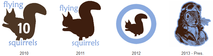
For me, though, nothing beats having an identity that is uniquely your own. There are many Cardinals, Tigers, Pirates, and Sox playing all kinds of ball, but you can still make yourself stand out from the pack while taking a name with "professional feel." HRL: Twin Cities does a good job with this. Their teams use only MLB club names, aside from the Gothams, but many do an outstanding job going their own way with the look. A look at past team has these gems: Astros, Brewers, Mariners, Padres, and this fabulous take on Tigers. The current set of teams keeps bringing the fun, too. Whether it be the eXpos with their "The X" anti-logo, the Mets classy way to carry a beer can, the Pilots geared up to do the "YMCA", or the Pirates who I've fawned over before. Without a doubt, though, my favorite team to "make the name their own" are HRL's Reds.
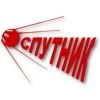
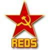 The Reds take the communist connection of the term that scared the professional baseball club in the 1950s and run wild with it. Their current look, which has been used since 2010, brandishes the hammer and sickle in gold on a bright red star. This same logo was used in 2007 when they were founded. During 2007, they used this "Communist Party" design on their jerseys, making this theme that much more awesome! As if that is not enough, the Reds rocked a Sputnik design for two years from 2008 - 2009.
For me, though, nothing beats having an identity that is uniquely your own. There are many Cardinals, Tigers, Pirates, and Sox playing all kinds of ball, but you can still make yourself stand out from the pack while taking a name with "professional feel." HRL: Twin Cities does a good job with this. Their teams use only MLB club names, aside from the Gothams, but many do an outstanding job going their own way with the look. A look at past team has these gems: Astros, Brewers, Mariners, Padres, and this fabulous take on Tigers. The current set of teams keeps bringing the fun, too. Whether it be the eXpos with their "The X" anti-logo, the Mets classy way to carry a beer can, the Pilots geared up to do the "YMCA", or the Pirates who I've fawned over before. Without a doubt, though, my favorite team to "make the name their own" are HRL's Reds.
The Reds take the communist connection of the term that scared the professional baseball club in the 1950s and run wild with it. Their current look, which has been used since 2010, brandishes the hammer and sickle in gold on a bright red star. This same logo was used in 2007 when they were founded. During 2007, they used this "Communist Party" design on their jerseys, making this theme that much more awesome! As if that is not enough, the Reds rocked a Sputnik design for two years from 2008 - 2009.