 | Wiffle Logos in Words | |
| by Brandon Corbett |
 There is a trend in the NBA that is a joke on par with "that's what she said" at college parties. It almost seems to be mandatory that a team's primary logo feature a basketball, or in some cases be nothing but a basketball. You would think that a team at the pinnacle of the sport would be recognized as a basketball team, and thus render the inclusion of a basketball completely redundant. They keep showing up, though, and it humors design-geeks worldwide.
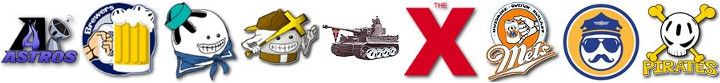
Now, it may be redundant for the biggest professional basketball league, but how about for a sport as grassroots and "up-and-coming" as Wiffleball? In our case, I think inclusion of a Wiffle ball or bat as a design element can actually be a good service to both the team and sport as a whole. Even with all the success a team like Freaky Franchise had in 2012, nobody outside of a Wiffleball circle will recognize that name as an NWLA Tournament champion. When they see the ball-headed logo, though, they will make the connection. Same for a storied team like the KWL's Industrials: "is that a labor union? Beer-league hockey? Oh, that's that plastic ball we played with in the backyard as kids!" Boom. Connected.
I thought it would be fun to look at exactly where Wiffleball leagues, in general, measure up in relation to the NBA and other sports leagues when it comes to using equipment in their team's primary designs. I included 14 Wiffleball leagues to get a decently varied sample. Also, note that the term "ball" includes the puck for NHL teams.
| League | # Teams | # w/ Ball | % w/ Ball | # w/ Other Equip* | % w/ Any Equip |
| NBA | 30 | 20 | 66.67 | 1 | 70.00 |
| NFL | 32 | 2 | 6.25 | 3 | 15.63 |
| MLB | 30 | 10 | 33.33 | 3 | 43.33 |
| NHL | 30 | 5 | 16.67 | 2 | 23.33 |
| MLS | 19 | 8 | 42.11 | 0 | 42.11 |
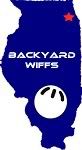
| WIFFLE | 160 | 105 | 65.63 | 19 | 77.50 |
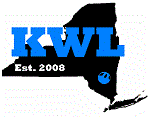
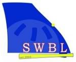
| Wiffle leagues used: CWA, GSWL, HFWB, HRL, KWL, NWBL, OCWA, ORWBL, PWLSD, SWBL, WATL, WDSL, WSEM, WWL | |||||
As should be expected, the NFL takes a stand as a league of teams not needing to identify their sport. Only two teams feature a football: the Buccaneers and Jets. Three teams - Miami, Oakland, and Cleveland (duh) - also showcase a helmet. Still, this makes up only 15.63% of the league: by far the lowest proportion of all the professional leagues. The NHL
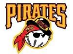
MLB, a source of many Wiffle team logos, and MLS jump up a bit and come in at 42.33% and 42.11%, respectively. Very similar overall, but while all of the MLS teams feature a soccer ball only 10 of the 30 (33.33%) MLB teams use a baseball. The Pirates and Cardinals both feature a bat, and the Rays use the infield diamond to add to the total use of equipment, though.
 I mentioned "mandatory" earlier in regard to NBA teams using equipment, and now we see just how close to accurate that is. Two-thirds of the league uses a basketball in their primary logo. When you add in the Rockets use of the rim, you end up with 70% of the league. Stout, and sure enough, Wiffleball stands toe-to-toe with the NBA numbers. 65.63% of the 160 teams sampled utilize a Wiffleball as part of their primary mark: just over 1% shy of the NBA. Since Wiffle has more vivid equipment to play with - bat, plate, etc. - we leapfrog the NBA in that category, though, bumping all the way up to 77.5%!
Breaking it down by individual Wiffle leagues, of the leagues sampled, we see that the HRL does the best job mimicking the NBA: two-thirds of their 18 teams feature a ball. Looking at the extremes, three leagues - GSWL, SWBL, and HFWB - have 100% of their teams showing a piece of equipment. SWBL and HFWB both have the Wiffle ball in 100% of their teams' primaries. On the other end, the WWL has the lowest percentage of teams with a ball, of leagues sampled, in their design at 12.5%. However, ORWBL has the least amount of equipment in general, just 25%.
Going to equipment seems extraneous and a bit cliche for professional teams, but in Wiffleball it seems less like a crutch and more like a sign of community and pride. It is true that the popularity of Wiffle has grown immensely over the past five years, however, the sport is still rarely recognized outside our circles. When teams promote the sport along with themselves by using a ball or bat it does not come off as a joke, rather as a vanguard for the game. In thirty years when Wiffle is dominating the programming on ESPN8 we can revisit the issue, but for now, keep flashing those balls!
* i.e. bat, stick, rim, helmet, playing surface. Not counted if ball also included
** roundels or ellipses alone not taken to represent ball or puck
** roundels or ellipses alone not taken to represent ball or puck