 | Wiffle Logos in Words | |
| by Brandon Corbett |
The Crofton Wiffleball Association burst onto the scene about one year ago and caught everyone's attention. Foremost, they were Canadian, so it felt exotic. Secondly, they were in the northern lands AND playing "spring training" games throughout the late winter, when most U.S. leagues were huddled under blankets. Thirdly, they put together a nice website, continued to grow, and consistently put out nice videos and updates. That last point comes as no surprise, since (at least one of) the guys who run the league are responsible for Francis Media, a video marketing firm specializing in web promotions. They piggyback the league website off the Francis Media site if you're interested in checking out their day job.

They had four teams when they began playing: Destroyers, North Stars, Rookies, and Skididdlers. The Rookies rebranded as the Rockies before spring league play started, and it is one of the best updates I have seen in Wiffle logos. It is superior to the MLB's Colorado Rockies logo with mountains, the forest, and a river in muted tones in the upper half and Vancouver Island represented in the lower half. The logo also features a unique-to-the-league Wiffleball as the "o" in Rockies, which has also been used by the Smoke Stacks and Wiffers / Sea Monsters franchises.

 Those latter two franchises were part of a spring expansion to six teams. The Stacks logo invokes Hexus (I, hereby, promise not to bring up Fern Gully again) with its demonizing portrayal of industry into something Al Gore might consider tattooing on his chest. The Wiffers went with a more simplistic approach, but the arched text mimics the swing-and-miss motion; effectively bringing out the hopelessness in the name "Wiffers". The Smoke Stacks along with the Skididdlers were later contracted during the season to improve quality of play and attendance. What we are left with heading into 2013 are four teams: Destroyers, North Stars, Rockies, and Sea Monsters.
The Destroyers and North Stars have kept their looks since their beginning. The Stars utilize a wonderful kelly green and yellow color scheme, featuring a maple leaf over a star. Is it a simple logo? Yes, but that often makes for the best and longest lasting looks. The Destroyers play to the other end of the spectrum with no less success: a Wiffle-holed skull biting down on crossed bats with flames and "Destroyers" arched above in a custom font. It works so well, because everything you are looking at screams, "DESTROY!"
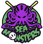
 In addition to the aforementioned, fantastically designed Rockies, the Sea Monsters are the re-branded Wiffers franchise. They keep green in their color scheme, but shift it toward a more aquatic tone. They also keep the league-unique Wiffleball in the design as the 'o' in Monsters, as well as applying the holes to the octopuses head. The purple, green, and black colors are bold and unique, perfectly fitting the team name and livery along the coast of the Pacific Northwest (or Southwest on a map of Canada).
The other three Crofton teams each take their own unique section of the color spectrum, too. The Destroyers are very warm with red, black, and orange; the Rockies are subtly cool with their blue-violet, pale blue, and grey; and the North Stars stand out with their bright green and yellow scheme.
From top to bottom the CWA has their stuff together; including the highly noticeable stuff, such as video of the year or very informative player profiles, and the minutia like team colors. These guys know what they are doing, and are doing a great job at helping expand Wiffleball into Canada. With any luck we will have another fantastic league to follow in the north-country before MLB tries its hand their again (Actually, I really want the Expos back. Maybe these can come simultaneously).

They had four teams when they began playing: Destroyers, North Stars, Rookies, and Skididdlers. The Rookies rebranded as the Rockies before spring league play started, and it is one of the best updates I have seen in Wiffle logos. It is superior to the MLB's Colorado Rockies logo with mountains, the forest, and a river in muted tones in the upper half and Vancouver Island represented in the lower half. The logo also features a unique-to-the-league Wiffleball as the "o" in Rockies, which has also been used by the Smoke Stacks and Wiffers / Sea Monsters franchises.

 Those latter two franchises were part of a spring expansion to six teams. The Stacks logo invokes Hexus (I, hereby, promise not to bring up Fern Gully again) with its demonizing portrayal of industry into something Al Gore might consider tattooing on his chest. The Wiffers went with a more simplistic approach, but the arched text mimics the swing-and-miss motion; effectively bringing out the hopelessness in the name "Wiffers". The Smoke Stacks along with the Skididdlers were later contracted during the season to improve quality of play and attendance. What we are left with heading into 2013 are four teams: Destroyers, North Stars, Rockies, and Sea Monsters.
The Destroyers and North Stars have kept their looks since their beginning. The Stars utilize a wonderful kelly green and yellow color scheme, featuring a maple leaf over a star. Is it a simple logo? Yes, but that often makes for the best and longest lasting looks. The Destroyers play to the other end of the spectrum with no less success: a Wiffle-holed skull biting down on crossed bats with flames and "Destroyers" arched above in a custom font. It works so well, because everything you are looking at screams, "DESTROY!"

 In addition to the aforementioned, fantastically designed Rockies, the Sea Monsters are the re-branded Wiffers franchise. They keep green in their color scheme, but shift it toward a more aquatic tone. They also keep the league-unique Wiffleball in the design as the 'o' in Monsters, as well as applying the holes to the octopuses head. The purple, green, and black colors are bold and unique, perfectly fitting the team name and livery along the coast of the Pacific Northwest (or Southwest on a map of Canada).
The other three Crofton teams each take their own unique section of the color spectrum, too. The Destroyers are very warm with red, black, and orange; the Rockies are subtly cool with their blue-violet, pale blue, and grey; and the North Stars stand out with their bright green and yellow scheme.
From top to bottom the CWA has their stuff together; including the highly noticeable stuff, such as video of the year or very informative player profiles, and the minutia like team colors. These guys know what they are doing, and are doing a great job at helping expand Wiffleball into Canada. With any luck we will have another fantastic league to follow in the north-country before MLB tries its hand their again (Actually, I really want the Expos back. Maybe these can come simultaneously).

