 | | Wiffle Logos in Words |
| by Brandon Corbett |

Shockingly, no teams from known Wiffle leagues use the English terms "devils" or "demons" in their names; whether red, blue, or sun there are none to be found. This is a fascinating anomaly, and I honestly have no idea why. It could be as simple as there not being much demonic nomenclature used by baseball, in general; I am sure there is a wormhole to slip through and find many reasons why distance is kept between "America's pastime" and
dark names. Numerous Wiffle teams use "angels" like MLB, of course, but the only reference ever made in English to the other side was the Fallen Angels from
CCWA, who disbanded in 2011.
As soon as you break the language barrier, though, the devils are let loose. Five teams use the Spanish terminology, "Diablos," which we have to admit is a much livelier choice!
 |
KWL's Diablos are probably the most well-known of these teams. Founded as the Indians in 2007, the team would bear their horns in 2009 when they possessed the Detroit Tigers' old-English "D" logo. The horns and tail are a clever play on the letter, and fit perfectly.
|
 |
A much lesser known team, SSWBL's Diablos, take a much more serpentine approach. The long, pointed tail is the focus here, twisting around and forming the 'D'. Along with the dark tones it certainly conveys "shadowy figures". |
|
 |
As with all Golden Stick logos, GSWL's Diablos is very well done. They are also the only Diablos team to feature a human-faced devil, including everyone's second-favorite devilish characteristic: the pointy goatee. |
|
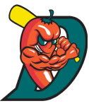 |
MWLWI's Diablos use the logo of the Texas League's El Paso Diablos with a few minor color changes. I normally wouldn't write about it, but this logo shows one key anatomy lesson: the difference in muscle structure between humans and demon peppers. |
|
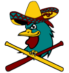 |
Then we have WSEM's El Diablos who, with the most unique treatment of the name, go all Ricky Bobby on us. "Like... a fighting chicken," they eschew all demonic imagery, instead playing up the mistranslated Spanish with a sombrero-clad, scowling rooster. |
|
