
 | Wiffle Logos in Words | |
| by Brandon Corbett |
Using state, county, or other geographic outlines in logos is a fantastic way to class up a team identity, and one that is highly underutilized. Even as a fan of showing off regional pride I count that as a good thing; under-use keeps over-saturation and commonplace out of the picture, after all. If state outlines ever became an overblown fad like grey in college basketball, random light/navy blue thirds in hockey, or "let's have a fashion show every week" in college football, I would probably start burning maps and moving loads of earth in lieu of sleep and financial responsibility just to screw up the designs #harlequin. Happily, that is not the case. Texas gets used quite often: Stars, Dallas Texans, Astros, but is best executed by the Houston Gamblers. Wisconsin also gets a bit of outlined love with the Brewers, Braves before them, and this awesome Packers alternate. Louisiana lends itself perfectly to an 'L' team, the Twins probably have my favorite of all of these, though the Squires are not far behind, the Kansas City Chiefs get a special nod for trying to capture nearly all land west of the Mississippi, while the Islanders win the "not a state, but we should be!" honor.
This trend translates to Wiffleball with leagues utilizing their home states to show off their game, and help outsiders easily identify their location. This is not a ranking, just a showcase for geographic flare in the Wiffle flavor. Who is up for an e-road trip?
This trend translates to Wiffleball with leagues utilizing their home states to show off their game, and help outsiders easily identify their location. This is not a ranking, just a showcase for geographic flare in the Wiffle flavor. Who is up for an e-road trip?
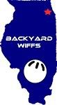 BWBL | Very Dallas Texans-esque. Within a few seconds of looking at the BWBL logo I can tell - even hungover - that they play Wiffleball, that they play Wiffleball in Illinois, and not only do they play in Illinois, but they play Wiffleball up in the northeast corner of Illinois. This is effective. |
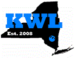 KWLNY | The Empire State is an odd case in that it has a unique shape, but is still rarely used in logos. So, kudos to KWLNY for representing New York. I believe the ball pulls double duty as a location identifier, but I may be wrong. Either way, it is a good use of the irregular shape. |
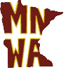 MNWA | I am not sure if this is the official MNWA logo, but it is used as the link on the NWLA site. Plus the Golden Gopher colors go well with the fantastic league logos MNWA uses, so I am going to roll with it. Everyone likes acronyms, and I obviously dig state outlines, so naturally working the acronym into Minnesota is an excellent move. |
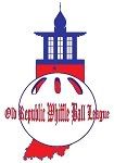 ORWBL | At a quick glance you might miss that Indiana is the base for the ORWBL logo. That is due to the great execution of including the Old Republic, a building in New Carlisle and league namesake, atop the state. Everything balances out very well. |
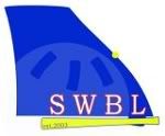 SWBL | The smoothed outline and faint, almost watermarked Wiffle ball give a very clean look to the SWBL. The slight bit of red on the letters, yellow bat underline, and yellow location dot add a little pop, as well. |
 WSEM | In the spirit of unbiased opine, I cannot really talk about WSEM's design. So, I will just drop one quick comment: How can you not do this with a Michigan Wiffle logo? |
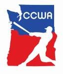 CCWA | I know I said this is not a ranking, but if it was... hypothetically... Columbia Cowlitz is my favorite. So, we end our e-road trip there. Two states(!), negative space, a great swinging silhouette, well-balanced, and simple. |