
 | Wiffle Logos in Words | |
| by Brandon Corbett |
The Flying Squirrels of WSEM have existed for four years, including their commitment for the 2013 season. They have had four different primary logos in that time. Additionally, they have had six alternates (seven if you count the Blue Jays-esque Opening Drey number), two jersey scripts, and two field logos. On the surface that sounds schizophrenic as hell. To be fair, it kind of is. However, when you actually look at the progression of the primaries, the identity as a whole has been tracking in one consistent direction: the "flying" aspect. In 2010, the team took the name from the Richmond Flying Squirrels for use in the London Tournament, but opted not to use the minor league club's logo or colors. They instead wore light blue (for the sky, "lofty expectations") and brown (for the dirt, "being able to dig out wins"), and wore a simple squirrel silhouette with player numbers inside plus wordmark.
 When WSEM began league play in 2011, the Squirrels updated by tilting the Squirrel slightly to better show off that it's flying, hence garnering the nickname "Tipsy" for the mascot. The wordmark was kept around the Squirrel for the inaugural season, and a wiffled acorn and FS-tail logo were added as alternates. An arched "flying Squirrels" wordmark was made for the jersey, utilizing the acorns to dot the i's and the squirrel silhouette prominently as the S in Squirrels. Lore has it that the acorn over the "i" in Squirrels represented their past championship (the 2010 Fall Tournament) being "behind" the team, while the acorn over the "i" in flying represented their chase of future championships as it hung in front of the squirrel.
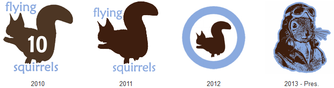
In 2012 the Squirrels pushed the "flying" aspect even more. They stripped the wordmark from their primary logo, and made it a roundel heavily based off that used by the RAAF. Roundels are everywhere in baseball nowadays, but when the team is playing off a motif dating back to the dawn of military aviation that can be easily overlooked. The jersey wordmark was also updated to a script "Squirrels", still utilizing the silhouette as the 'S' and an acorn to dot the 'i'; they also added a brown road jersey with the same script in blue. As a novelty the Squirrels also introduced the "angry Tipsy" logo, a mockery and play off of the updates made to the Detroit Lions look, complete with an "angry eye", "pointy tail", and "sharp claws" to make it look more fierce. Had late and offseason personnel moves not occurred, it is speculated angry Tipsy would have become the primary, and rendered this article entirely false. However, fate intervened, and now the progression towards flight... flies onward.
 Led by new captain, Adam Cosby, the 2013 Flying Squirrels identity entirely drops Tipsy and the acorn from use - leaving them to the memory of "ye olde regime." The new primary mark is a squirrel's head and bust donning a circa WWII pilot's helmet, goggles, jacket and scarf. It's like Rocky grew up, learned to love cool things, met the Baltimore Oriole, and posed for a classy picture. The look conveys the sentiment, "yes, I'm a Squirrel, but more than that... I'm a flyboy first!" Perfectly fitting for the evolution this team's identity has been headed down. The only old logo that returns is the FS-tail as a secondary, which you have to admit could look sweet on a bomber jacket.
One more thing you have to admit, and applaud, is that - even with their perennially shifting identity - the Squirrels have never strayed from the bold light blue and brown color scheme. That is the kind of commitment that could see them coming onto the field dressed in Twisted Sister get-up, but so long as it was light blue and brown (with a pass given on red lipstick), you'd recognize them as the Squirrels. So, Squirrels, change logosas often as you want every year if you want, just keep the colors flying!
 Full disclosure: Brandon played for the Squirrels from 2010 - 2012, and was responsible for the identity package throughout that time. He harbors no grudge towards the franchise, and loves what Adam has done in terms of personnel and identity. He also respects Adam for retiring the acorn and Tipsy marks upon his takeover. Rumors about him using his old Squirrel jerseys to stuff his crotch are almost entirely unfounded, except for that one time.
When WSEM began league play in 2011, the Squirrels updated by tilting the Squirrel slightly to better show off that it's flying, hence garnering the nickname "Tipsy" for the mascot. The wordmark was kept around the Squirrel for the inaugural season, and a wiffled acorn and FS-tail logo were added as alternates. An arched "flying Squirrels" wordmark was made for the jersey, utilizing the acorns to dot the i's and the squirrel silhouette prominently as the S in Squirrels. Lore has it that the acorn over the "i" in Squirrels represented their past championship (the 2010 Fall Tournament) being "behind" the team, while the acorn over the "i" in flying represented their chase of future championships as it hung in front of the squirrel.In 2012 the Squirrels pushed the "flying" aspect even more. They stripped the wordmark from their primary logo, and made it a roundel heavily based off that used by the RAAF. Roundels are everywhere in baseball nowadays, but when the team is playing off a motif dating back to the dawn of military aviation that can be easily overlooked. The jersey wordmark was also updated to a script "Squirrels", still utilizing the silhouette as the 'S' and an acorn to dot the 'i'; they also added a brown road jersey with the same script in blue. As a novelty the Squirrels also introduced the "angry Tipsy" logo, a mockery and play off of the updates made to the Detroit Lions look, complete with an "angry eye", "pointy tail", and "sharp claws" to make it look more fierce. Had late and offseason personnel moves not occurred, it is speculated angry Tipsy would have become the primary, and rendered this article entirely false. However, fate intervened, and now the progression towards flight... flies onward.
Led by new captain, Adam Cosby, the 2013 Flying Squirrels identity entirely drops Tipsy and the acorn from use - leaving them to the memory of "ye olde regime." The new primary mark is a squirrel's head and bust donning a circa WWII pilot's helmet, goggles, jacket and scarf. It's like Rocky grew up, learned to love cool things, met the Baltimore Oriole, and posed for a classy picture. The look conveys the sentiment, "yes, I'm a Squirrel, but more than that... I'm a flyboy first!" Perfectly fitting for the evolution this team's identity has been headed down. The only old logo that returns is the FS-tail as a secondary, which you have to admit could look sweet on a bomber jacket.One more thing you have to admit, and applaud, is that - even with their perennially shifting identity - the Squirrels have never strayed from the bold light blue and brown color scheme. That is the kind of commitment that could see them coming onto the field dressed in Twisted Sister get-up, but so long as it was light blue and brown (with a pass given on red lipstick), you'd recognize them as the Squirrels. So, Squirrels, change logos
Full disclosure: Brandon played for the Squirrels from 2010 - 2012, and was responsible for the identity package throughout that time. He harbors no grudge towards the franchise, and loves what Adam has done in terms of personnel and identity. He also respects Adam for retiring the acorn and Tipsy marks upon his takeover. Rumors about him using his old Squirrel jerseys to stuff his crotch are almost entirely unfounded, except for that one time.
Corbs, you know you will be wearing the lovely light blue once again in London <3
ReplyDelete-Coffee