We are not sure if a picture really says 1,000 words, or if a logo has even half that many in its vocabulary, but a logo should tell you a lot about the team or league using it: character, how they approach and play the game, what they are all about. Sometimes the words here will be gushing over a design we find interesting, amazing, or ridiculous in the best possible way. Sometimes they may be about the design process or evolution, the genesis of an idea and how it came to be, or team history. Other times we may try to look at trends and different nuances from around the Wiffle world.

A League of (Your) Own

Wiffle Logos in Words
by Brandon Corbett

Wiffler's Digest has had a poll up asking whether or not "you approve of Wiffleball leagues using MLB team names." I answered no, with a caveat: using the names is okay so long as you create your own look with some of your personality put into it; otherwise it is rather boring, which is the polar opposite of Wiffleball. Currently, "yes" is receiving 70% of the vote in that poll, though, so what do I know? I actually do understand why teams use pro's looks. An interview with Hess Field done in 2011 mentions, "giv(ing) up silly team names, like the Circumcisers, and switch(ing) to MLB team names, insisting it gave the league a more professional feel and made ordering uniforms easier." It is true, MLB logos have a lifetime of stock built up with us. When we put that on or by our name, we feel like part of that. And yeah, the fact they are ready to go probably helps in the decision, too.


For me, though, nothing beats having an identity that is uniquely your own. There are many Cardinals, Tigers, Pirates, and Sox playing all kinds of ball, but you can still make yourself stand out from the pack while taking a name with "professional feel." HRL: Twin Cities does a good job with this. Their teams use only MLB club names, aside from the Gothams, but many do an outstanding job going their own way with the look. A look at past team has these gems: Astros, Brewers, Mariners, Padres, and this fabulous take on Tigers. The current set of teams keeps bringing the fun, too. Whether it be the eXpos with their "The X" anti-logo, the Mets classy way to carry a beer can, the Pilots geared up to do the "YMCA", or the Pirates who I've fawned over before. Without a doubt, though, my favorite team to "make the name their own" are HRL's Reds.
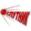
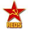
The Reds take the communist connection of the term that scared the professional baseball club in the 1950s and run wild with it. Their current look, which has been used since 2010, brandishes the hammer and sickle in gold on a bright red star. This same logo was used in 2007 when they were founded. During 2007, they used this "Communist Party" design on their jerseys, making this theme that much more awesome! As if that is not enough, the Reds rocked a Sputnik design for two years from 2008 - 2009.

Flyboys

Wiffle Logos in Words
by Brandon Corbett

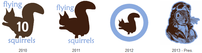
The Flying Squirrels of WSEM have existed for four years, including their commitment for the 2013 season. They have had four different primary logos in that time. Additionally, they have had six alternates (seven if you count the Blue Jays-esque Opening Drey number), two jersey scripts, and two field logos. On the surface that sounds schizophrenic as hell. To be fair, it kind of is. However, when you actually look at the progression of the primaries, the identity as a whole has been tracking in one consistent direction: the "flying" aspect. In 2010, the team took the name from the Richmond Flying Squirrels for use in the London Tournament, but opted not to use the minor league club's logo or colors. They instead wore light blue (for the sky, "lofty expectations") and brown (for the dirt, "being able to dig out wins"), and wore a simple squirrel silhouette with player numbers inside plus wordmark.

When WSEM began league play in 2011, the Squirrels updated by tilting the Squirrel slightly to better show off that it's flying, hence garnering the nickname "Tipsy" for the mascot. The wordmark was kept around the Squirrel for the inaugural season, and a wiffled acorn and FS-tail logo were added as alternates. An arched "flying Squirrels" wordmark was made for the jersey, utilizing the acorns to dot the i's and the squirrel silhouette prominently as the S in Squirrels. Lore has it that the acorn over the "i" in Squirrels represented their past championship (the 2010 Fall Tournament) being "behind" the team, while the acorn over the "i" in flying represented their chase of future championships as it hung in front of the squirrel.


In 2012 the Squirrels pushed the "flying" aspect even more. They stripped the wordmark from their primary logo, and made it a roundel heavily based off that used by the RAAF. Roundels are everywhere in baseball nowadays, but when the team is playing off a motif dating back to the dawn of military aviation that can be easily overlooked. The jersey wordmark was also updated to a script "Squirrels", still utilizing the silhouette as the 'S' and an acorn to dot the 'i'; they also added a brown road jersey with the same script in blue. As a novelty the Squirrels also introduced the "angry Tipsy" logo, a mockery and play off of the updates made to the Detroit Lions look, complete with an "angry eye", "pointy tail", and "sharp claws" to make it look more fierce. Had late and offseason personnel moves not occurred, it is speculated angry Tipsy would have become the primary, and rendered this article entirely false. However, fate intervened, and now the progression towards flight... flies onward.

Led by new captain, Adam Cosby, the 2013 Flying Squirrels identity entirely drops Tipsy and the acorn from use - leaving them to the memory of "ye olde regime." The new primary mark is a squirrel's head and bust donning a circa WWII pilot's helmet, goggles, jacket and scarf. It's like Rocky grew up, learned to love cool things, met the Baltimore Oriole, and posed for a classy picture. The look conveys the sentiment, "yes, I'm a Squirrel, but more than that... I'm a flyboy first!" Perfectly fitting for the evolution this team's identity has been headed down. The only old logo that returns is the FS-tail as a secondary, which you have to admit could look sweet on a bomber jacket.

One more thing you have to admit, and applaud, is that - even with their perennially shifting identity - the Squirrels have never strayed from the bold light blue and brown color scheme. That is the kind of commitment that could see them coming onto the field dressed in Twisted Sister get-up, but so long as it was light blue and brown (with a pass given on red lipstick), you'd recognize them as the Squirrels. So, Squirrels, change logos as often as you want every year if you want, just keep the colors flying!


Full disclosure:  Brandon played for the Squirrels from 2010 - 2012, and was responsible for the identity package throughout that time. He harbors no grudge towards the franchise, and loves what Adam has done in terms of personnel and identity. He also respects Adam for retiring the acorn and Tipsy marks upon his takeover. Rumors about him using his old Squirrel jerseys to stuff his crotch are almost entirely unfounded, except for that one time.

Draw the (State) Line

Wiffle Logos in Words
by Brandon Corbett

Using state, county, or other geographic outlines in logos is a fantastic way to class up a team identity, and one that is highly underutilized. Even as a fan of showing off regional pride I count that as a good thing; under-use keeps over-saturation and commonplace out of the picture, after all. If state outlines ever became an overblown fad like grey in college basketball, random light/navy blue thirds in hockey, or "let's have a fashion show every week" in college football, I would probably start burning maps and moving loads of earth in lieu of sleep and financial responsibility just to screw up the designs #harlequin. Happily, that is not the case. Texas gets used quite often: Stars, Dallas Texans, Astros, but is best executed by the Houston Gamblers. Wisconsin also gets a bit of outlined love with the Brewers, Braves before them, and this awesome Packers alternate. Louisiana lends itself perfectly to an 'L' team, the Twins probably have my favorite of all of these, though the Squires are not far behind, the Kansas City Chiefs get a special nod for trying to capture nearly all land west of the Mississippi, while the Islanders win the "not a state, but we should be!" honor.

This trend translates to Wiffleball with leagues utilizing their home states to show off their game, and help outsiders easily identify their location. This is not a ranking, just a showcase for geographic flare in the Wiffle flavor. Who is up for an e-road trip?


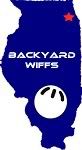
BWBL
Very Dallas Texans-esque. Within a few seconds of looking at the BWBL logo I can tell - even hungover - that they play Wiffleball, that they play Wiffleball in Illinois, and not only do they play in Illinois, but they play Wiffleball up in the northeast corner of Illinois. This is effective.

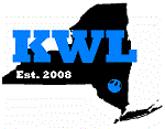
KWLNY
The Empire State is an odd case in that it has a unique shape, but is still rarely used in logos. So, kudos to KWLNY for representing New York. I believe the ball pulls double duty as a location identifier, but I may be wrong. Either way, it is a good use of the irregular shape.

MNWA
I am not sure if this is the official MNWA logo, but it is used as the link on the NWLA site. Plus the Golden Gopher colors go well with the fantastic league logos MNWA uses, so I am going to roll with it. Everyone likes acronyms, and I obviously dig state outlines, so naturally working the acronym into Minnesota is an excellent move.

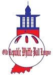
ORWBL
At a quick glance you might miss that Indiana is the base for the ORWBL logo. That is due to the great execution of including the Old Republic, a building in New Carlisle and league namesake, atop the state. Everything balances out very well.

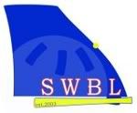
SWBL
The smoothed outline and faint, almost watermarked Wiffle ball give a very clean look to the SWBL. The slight bit of red on the letters, yellow bat underline, and yellow location dot add a little pop, as well.

WSEM
In the spirit of unbiased opine, I cannot really talk about WSEM's design. So, I will just drop one quick comment: How can you not do this with a Michigan Wiffle logo?

CCWA
I know I said this is not a ranking, but if it was... hypothetically... Columbia Cowlitz is my favorite. So, we end our e-road trip there. Two states(!), negative space, a great swinging silhouette, well-balanced, and simple.